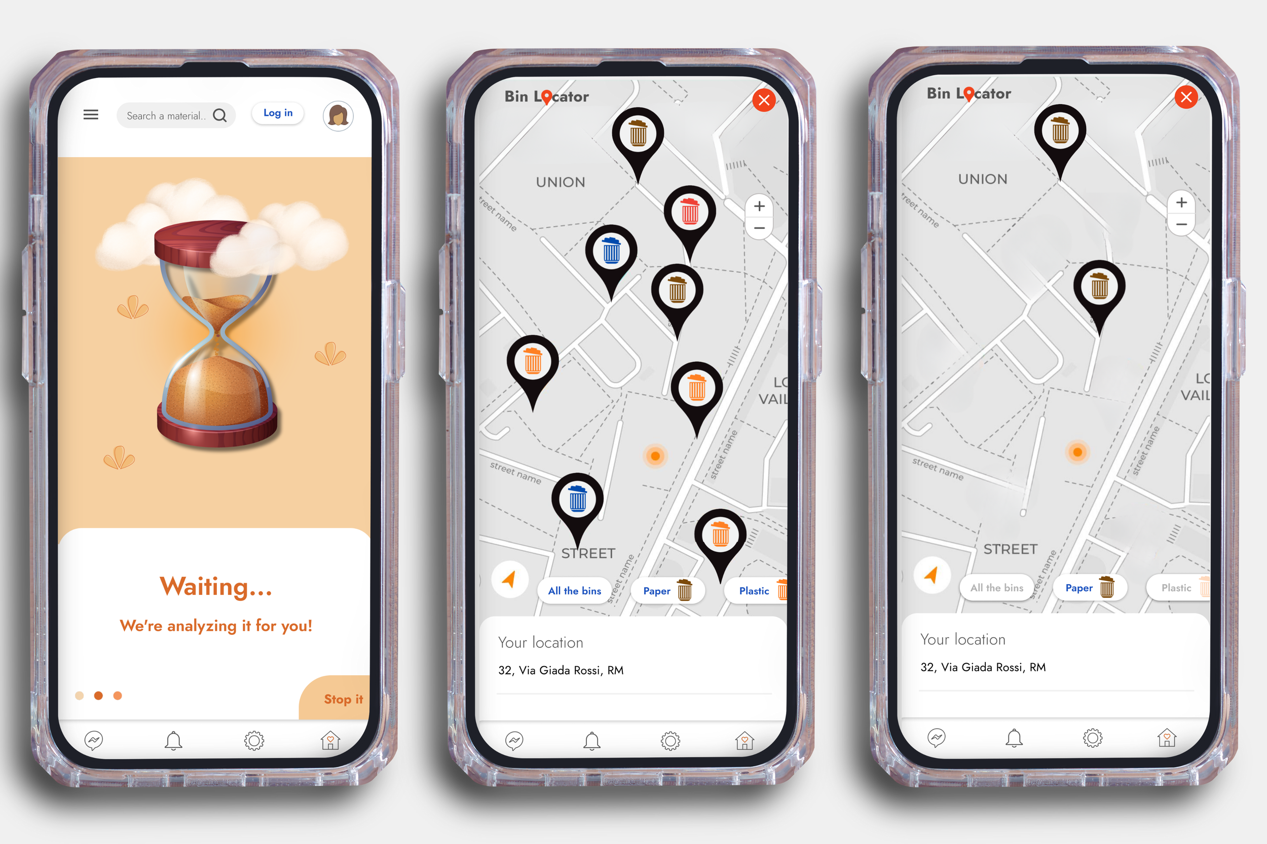
EasyWaste app
Description:
EasyWaste App is a UX/UI project designed to address the complex challenges of waste management in Rome.
The app simplifies recycling, connects citizens with authorities, and empowers users to participate in sustainable initiatives through intuitive and user-friendly features.
This project combine user research, interaction design, and strategic thinking to solve real-world problems.
Project Type:
Individual UX/UI project focused on waste management and civic participation
Project duration:
September 2024 - October 2024
Role: Product Designer
UX Designer: Conducted user research, designed user flows, wireframes, and prototypes for mobile and responsive web platforms.
UI Designer: Developed high-fidelity mockups, interactive prototypes, and visual design systems (color palettes, typography) to enhance usability and showcase key features.
Tools:
Figma
Canva
Methodology:
The project follows the Design Thinking framework.
The challenge
Living in Rome for over ten years gave me firsthand experience of the challenges citizens face with waste disposal.
Overflowing bins and unclear recycling information are common problems that highlight a gap in user-focused solutions.
This project aimed to bridge that gap by creating an app that simplifies waste management while promoting civic participation
Research
The research phase was crucial in identifying the needs of Roman residents struggling with waste sorting.
Through surveys and interviews, I gathered insights on user pain points, such as lack of information, inefficient bin placements, and limited communication channels with authorities.
To collect reliable data, I used a mixed-method approach, combining surveys and in-person interviews.
This approach ensured a comprehensive understanding of diverse user experiences.
Despite the challenge of engaging participants without a budget or incentives, those who contributed showed genuine interest and provided valuable insights, which I used to inform the design process and validate my findings.
Empathy maps
To better understand users and uncover common themes, I created aggregated empathy maps.
These maps summarize the different opinions and experiences shared by users, providing a clear overview of their thoughts, emotions, and behaviors about waste sorting and management in Rome.
Pain points
From the empathy maps, I was able to extract the main pain points of the users:
Lack of clear waste sorting information.
Difficulty accessing and using waste bins.
Poor communication channels with local authorities.
Limited motivation for civic engagement.
Based on the results obtained from the research, I decided to create
four Personas and the corresponding four User Journey maps to represent distinct user group:
Informed residents,
Uninformed residents,
Active citizens,
Indifferent citizens
Competitive audit
Overview
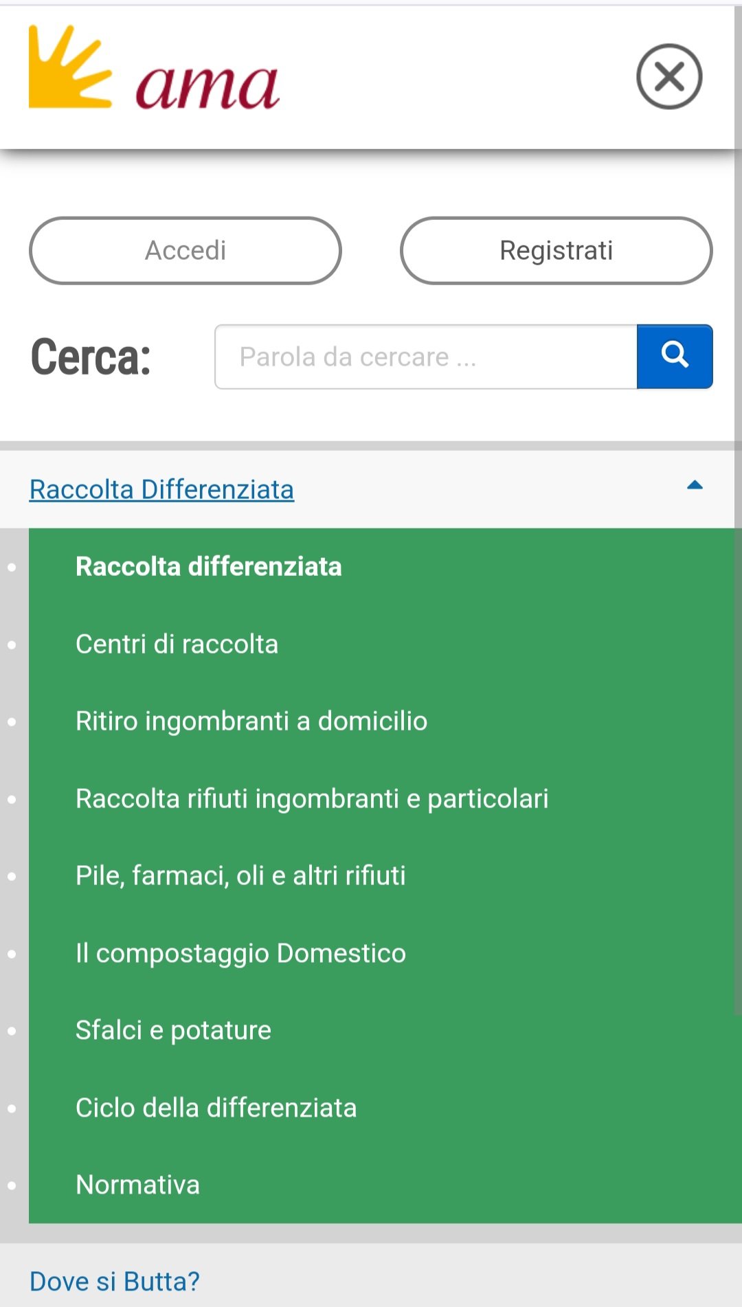
The main direct competitor identified is the AMA website, which manages waste collection in Rome.
Though no other direct competitors were found, I identified two relevant indirect competitors: Waste Less and TrashCash.
Key Insights
The competitive audit revealed three critical areas to focus on:
Usability: Simplifying navigation and ensuring user-friendly interactions.
Engagement: Encouraging active participation through interactive and visually appealing features.
Communication: Improving connections between users and local authorities.
Define phase
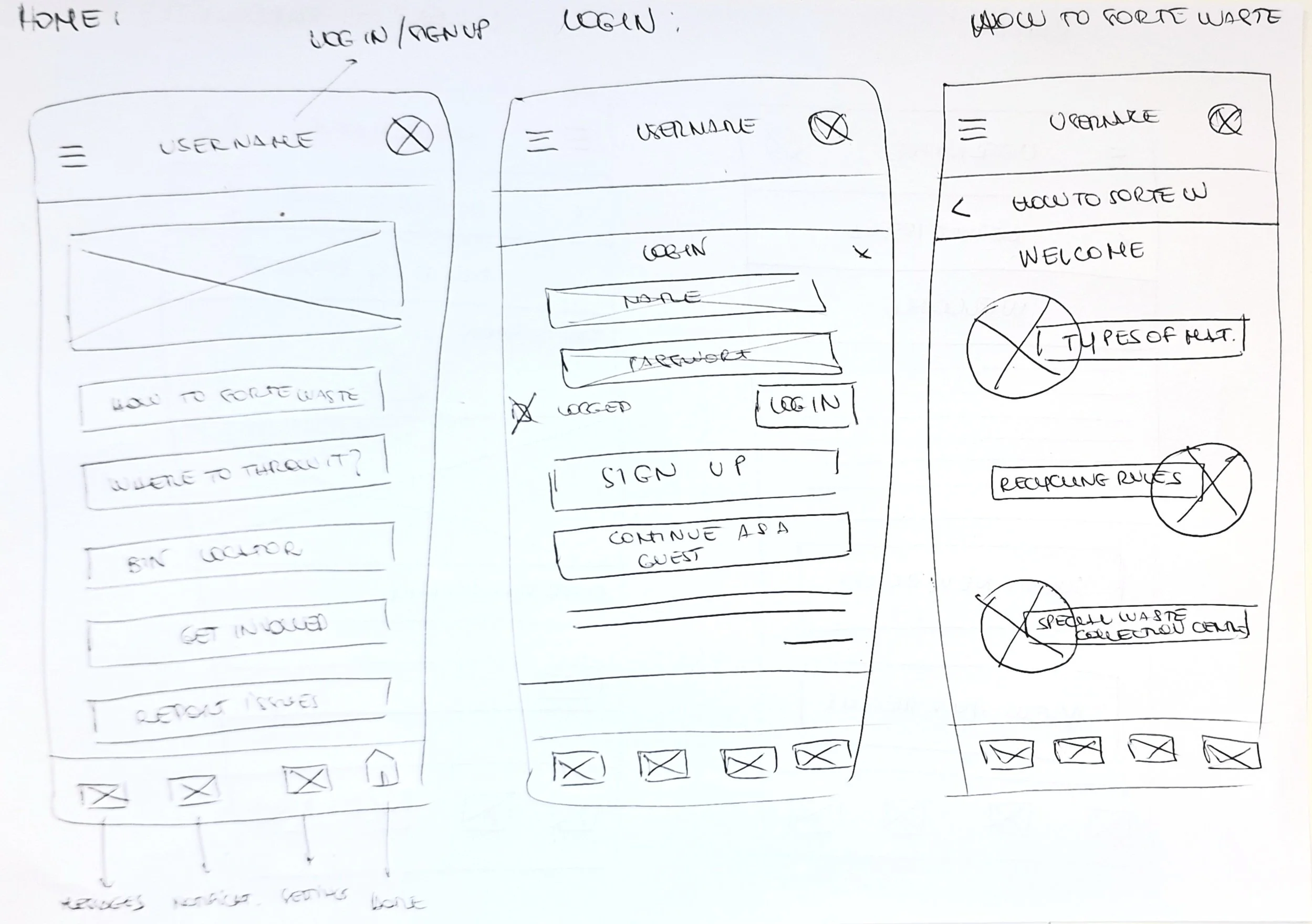
After defining the sitemap and main user flows, I began with hand-drawn sketches to explore layout ideas, then created detailed wireframes in Figma.
Prototyping phase
After defining the wireframes, I created a low-fidelity prototype to test some of the app’s key user flows and navigation.
The prototype focuses on simulating the interaction between selected sections, allowing for an early evaluation of the app's structure and functionality.
Problem solving
During First Testing:
Some functions required login, disrupting the flow in the Low-Fi prototype and making the app feel less welcoming.
Solution:
Moved the login prompt to specific sections where necessary, allowing users to explore the app freely at first.
Result:
Improved onboarding experience and increased user curiosity.
Usability Study
Before proceeding with the design and creation of mockups, I conducted a usability study to test the app’s navigation and user engagement.
I organized the collected feedback into key themes and insights.
These were then applied to refine the app’s design, ensuring it addressed user needs more effectively and improved the overall experience.
Design solution
Color palette choice
The app’s design reflects a vibrant, user-friendly aesthetic, inspired by Rome’s urban context.
I chose warm tones, ranging from brick to orange and pink, with the addition of blue to balance the warm chromatic scheme.
Blue (#1B52BF)
Light Orange (#F2BC79)
Pink (#F2D6BD)
Dark Orange (#D96A29)
Coral Red (#F2441D)
I then added two neutral colors to the palette for some secondary buttons:
Ice gray (F0F0F0)
Dark gray (525252), for the texts
Font choice
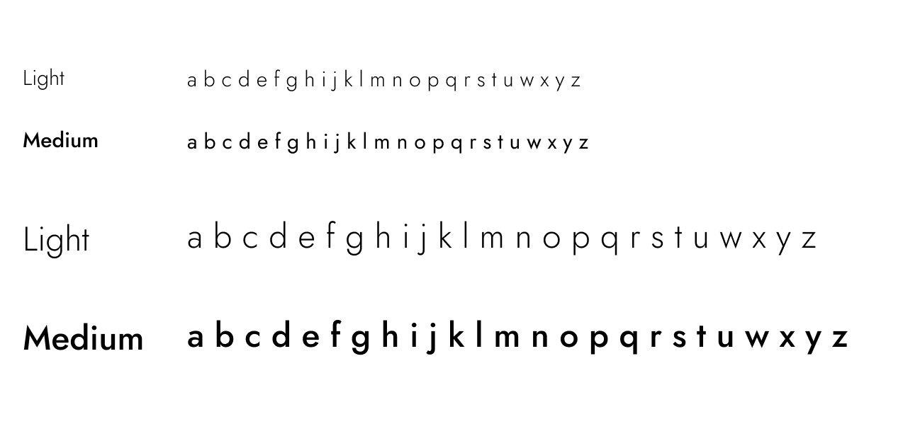
Regarding the font, I decided to choose the Figma font "Jost," as it conveys a sense of order while remaining soft and curved.
Mockups
Hi-Fi Prototype
Summary of the Final Testing
In the final design of the Hi- Fi prototype, through a new usability study, I found that the navigability needed greater fluidity.
Additionally, I would suggest including some links that connect the app to the corresponding sections of the Ama website of Rome, to further enhance the user experience.
This bar chart displays data regarding the final prototype testing results, highlighting key performance metrics.
The metrics I choose to include are:
Navigability (85%)
Usefulness (90%)
Satisfaction (75%)
Ease of Use (80%)
Reflections and next steps
Impact:
EasyWaste has the potential to transform waste management practices in Rome by providing clear guidance, fostering user engagement, and creating direct communication channels with authorities.
The app’s accessible design ensures inclusivity, empowering citizens to take an active role in improving their city.
Finally, the accessible design and support for waste differentiation make the app usable by a wide audience, facilitating sustainable waste management even among those who may have limited knowledge in this area.
Accessibility considerations:
High Contrast: Ensured readability with strong color contrasts.
Icons and Symbols: Designed to be visually clear and easy to differentiate.
Text Hierarchy: Created a clear structure to support possible voice guides.
Purpose: Messages are read in a logical order, improving accessibility and inclusivity for users with visual impairments.
Future product Features:
Integration with AMA Website
Links to the AMA website for detailed information on disposal rules and guidelines.AI-Powered Sorting Guidance
Advanced waste sorting using image recognition to identify recyclable materials.Location-Based Notifications
Alerts for collection days, special disposal rules, and nearby recycling centers.Interactive Bin Locator Map
Real-time updates on bin status and location, with a maximum delay of 10 minutes between reporting and intervention.


