Responsive App Design for Medical Supplies

Description:
This project aims to create an intuitive B2B portal that makes it easy for users to manage orders and monitor stock levels.
My goal was to design an interface that’s simple to use and easy to navigate, with products organized efficiently so that users can quickly find what they need without confusion.
The platform is a responsive app for managing and purchasing medical supplies, equipment, and vaccines.
Project Type:
Individual UI/UX project focused on the creation of a B2B responsive web platform and mobile app.
Project Duration:
August 2024 - August 2024
Role: UX/UI Designer
UX/UI Designer:
Site Map Creation
User Flows
Wireframing
UI Design (Mockups)
Prototyping
Tools:
Figma
Canva


Sitemap
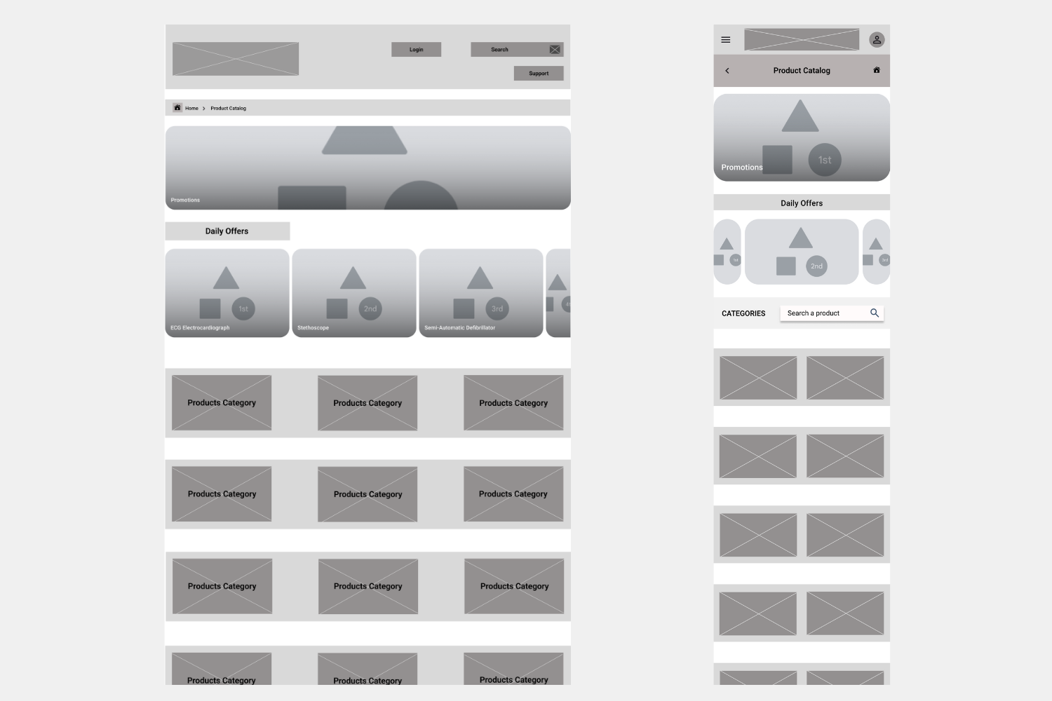
In the first step, I created a sitemap focused on usability and easy product finding.
The app provides also constant updates on "product inflow and outflow," so users receive alerts when a product is running low.

Wireframing
I began the design process by sketching initial wireframes using pen and paper.
These preliminary sketches allowed me to draft multiple iterations of each screen layout.


I also started to work on designs for additional screen sizes to make sure the site would be fully responsive across different devices

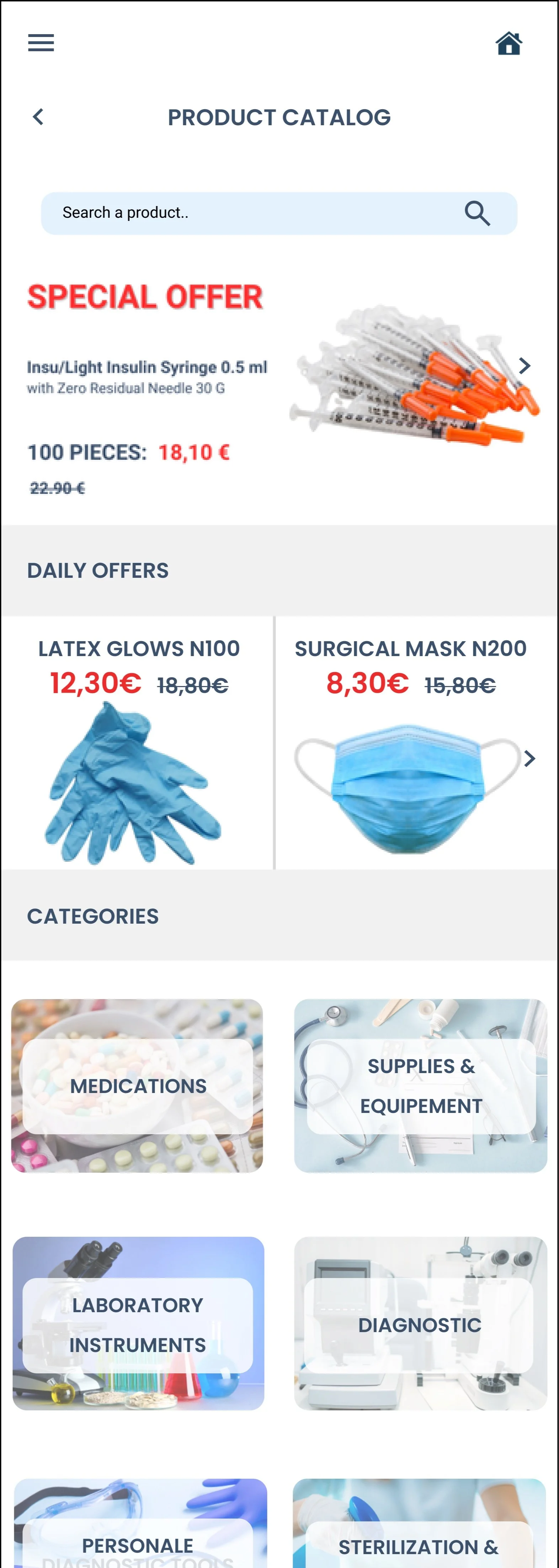
Home Page

Product catalog
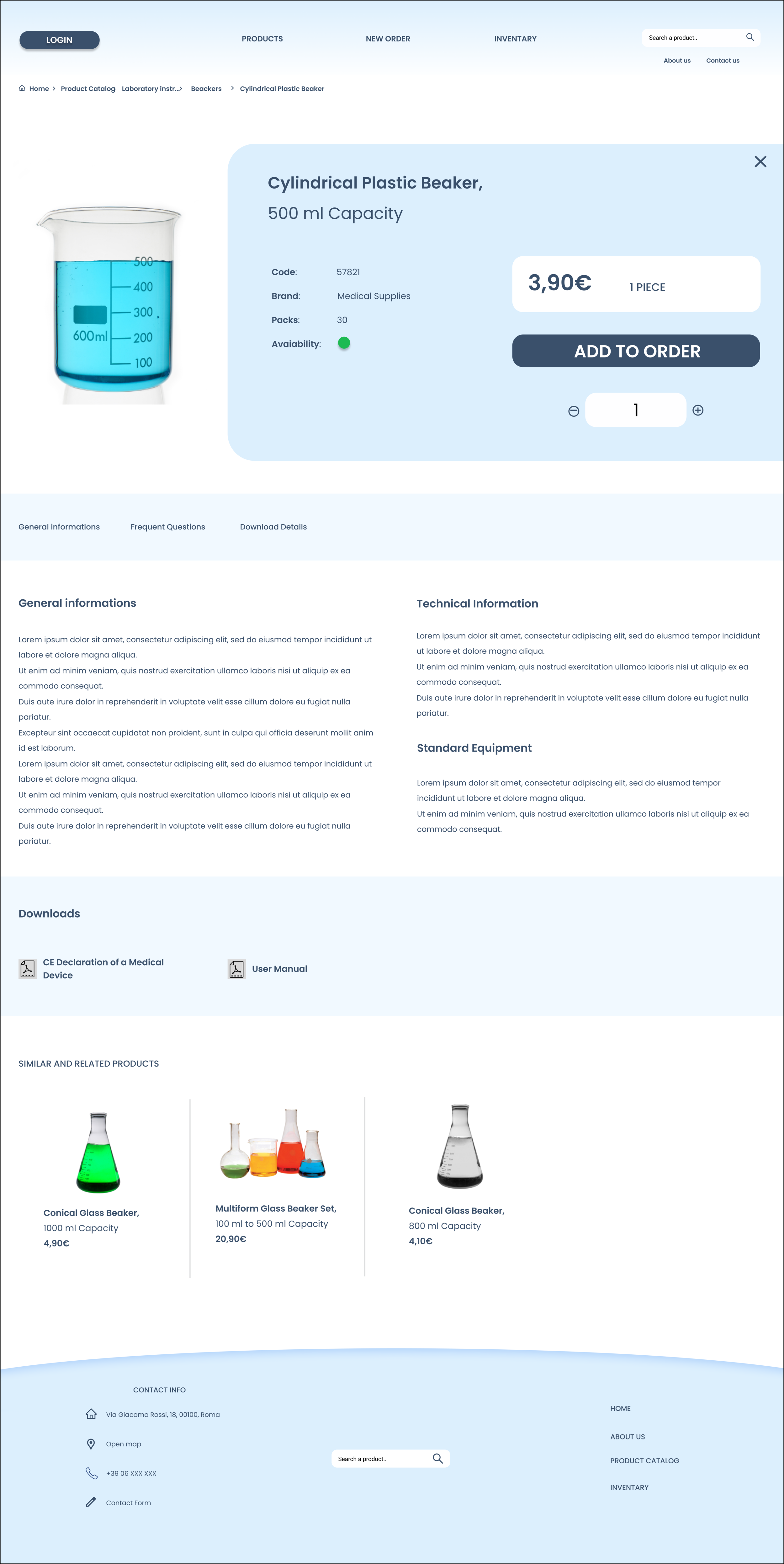
Product sheet
The product sheet has the "add to cart" option at the top for quick access.
Below, users find general information. Further down, they can download PDFs for detailed specs or manuals, keeping the main page clean.
A banner with related products helps users discover alternatives easily.
This layout improves navigation, saves time, and makes decisions smoother.


Design Solution

For the color palette, I chose a range of gray and blue shades to reflect the medical environment.
As the dominant color, I chose a light blue that provides a sense of calm and relaxation: (#DCEFFD)
For the accent colors, I selected dark blue (#3A506B) and sky blue (#69C0FF)
Very light gray (#F1F1F1): which I've used especially in the mobile version to separate sections with minimal color impact.
Lastly, I used red (#EC2C2C) sparingly to highlight promotional text and special offers, drawing attention without overwhelming the overall design.

For the font, I chose “Poppins” because it conveys a sense of balance and order without feeling too strict.

Mockups


Hi-Fi Prototype
Interactive Figma Prototype Preview


Final Considerations
Competitive Analysis
For this project, I conducted research on competitors to understand how medical supplies websites are typically structured.
This exploration was crucial, as it provided insights into industry standards and helped shape the design approach.

Next Steps
The next steps include:
Conducting an Usability Study to gather feedback on the user experience and identify areas for improvement.
Accessibility testing, user flow validation, and high-fidelity interaction design enhancements would also be necessary to ensure that the final product meets user needs and aligns with the overall project objectives.

Accessibility
Regarding accessibility, I have considered textual hierarchy to support potential voice-over tools for visually impaired users and aimed to maintain high contrast to assist users with low vision.
The design is responsive and adapts to various screen sizes, while color choices are made to avoid issues for users with color blindness.
Readable fonts and scalable text sizes further contribute to an inclusive user experience.
